Should you use a bar graph or a line chart? On the surface these seem like simple enough questions. However, data analysis has become a part of all our lives in the forms of infographics, Venn diagrams and word clouds to name a few, as the interest in making data visually appealing and meaningful continues to explode.
And when it comes to understanding visualized data, slight subtleties in presentation can make a demonstrable difference to how an audience perceives it. What do we really know about the science of data visualization?
source intelligentHQ
According to Robert Kosara in the Harvard Business Review, we know quite a lot, but there is much more to learn. The key, he says, is to make practical use of our scientific knowledge in order to merge form and function. For example, “Barbara Tversky and Jeff Zacks found in the early 2000s that lines imply transitions whereas bars imply individual values,” Kosara says.
How we think about lines and bars is just the tip of iceberg of what researchers have learned about the complex relationship between the brain and its interpretation of graphic representations of data. Kosara notes that while humans have been putting raw data into visual form for more than 200 years, it wasn’t until the 1960s that researchers including, Jacques Bertin, began trying to understand the interpretive process. Bertin was the first to systematically identify the different graphical ways to encode data, publishing his findings in the Semiology of Graphics, in 1969.
“Bertin coined many terms of the trade, such as the mark, which is the basic unit of every visualization, like a bar, line, or circle sector,” Kosara says, “He also defined a number of retinal variables, which are the visual properties we use to express the data; these include color, size, location, etc.”
While the field of visualization hadn’t quite come to fruition, more breakthroughs in our understanding came in the 1980s, as researchers in statistical graphics picked up on Bertin’s earlier work:
“William Cleveland and Robert McGill performed experiments to find out which of Bertin’s retinal variables were best suited for particular types of data, while Jock Mackinlay built a system that put Bertin’s and their work to use to create visualizations from data.
Thanks to Cleveland and McGill, we know that our perception is the most precise when it comes to understanding the location of a mark, followed closely by our ability to perceive length. We’re even less adept at perceiving area and orientation, and our ability to distinguish colors is even worse. We can see tiny differences in direction between lines that are almost but not exactly parallel, but we have a hard time quantifying an angle to say how many percent it represents in a pie chart. We can tell fewer than a dozen colors apart when their hues are very distinct, and can precisely compare shades of colors next to each other; but move them apart and surround them with very different ones, and it all goes out the window.”
But more knowledge about our ability to discern data points has only produced more questions. Kosara says it is time to think deeper about visualization.
The power of the visual metaphor
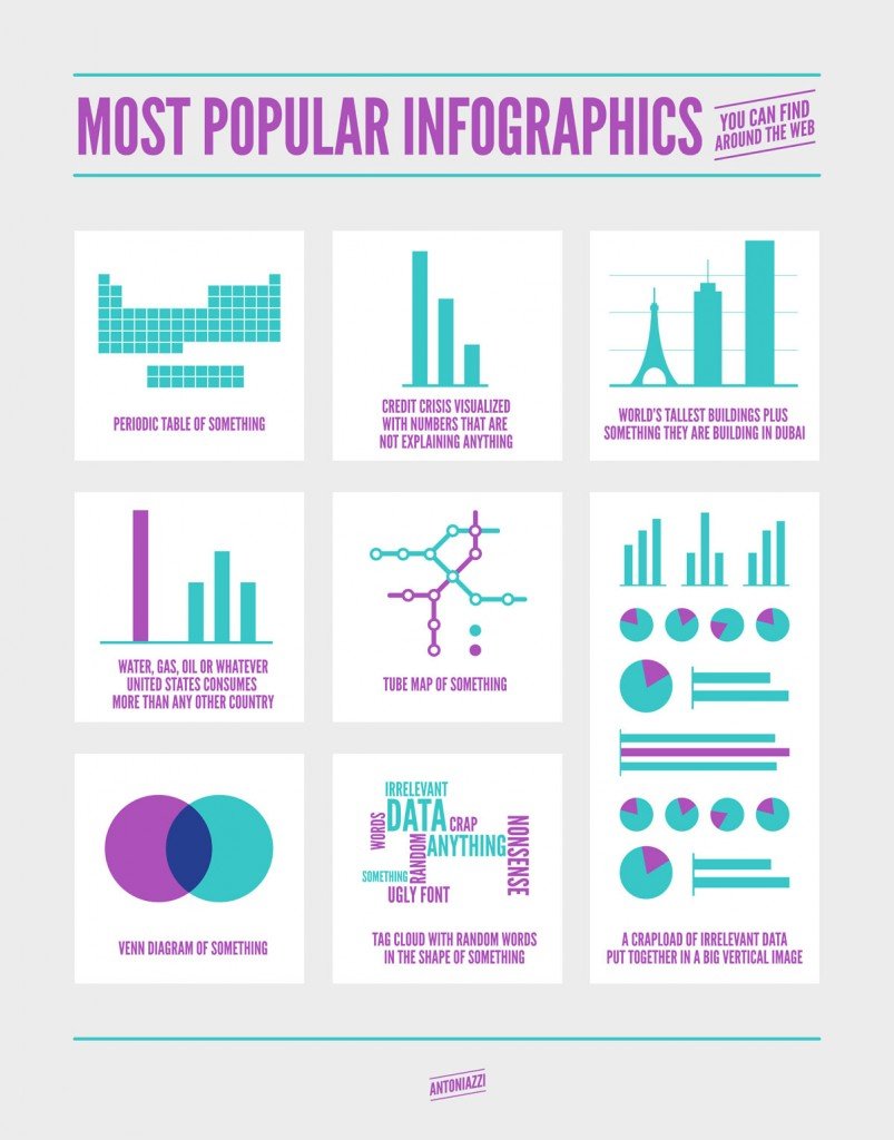
Most popular infographics source Alberto Antoniazzi
With the field of visualization in full swing, Kosara and his research team have been probing the effects of metaphors on users interpretations of data. Kosara and Caroline Ziemkiewicz’s 2009 study, Design Elements and the Perception of Information Structure, have come up with some interesting and relevant results. One of the more interesting is their exploration of the interaction between the “visual metaphor used to show data and the linguistic metaphor used to ask a question.” Kosara and Ziemkiewicz suggest that audiences may be significantly affected by the “physical and emotional inferences” from specific design elements in charts.
Kosara says that one of the more surprising and bizarre results included participants’ projection of the effects of gravity onto visual data:
“In our work on metaphors, Ziemkiewicz and I found that people interpreted round shapes as unstable because, they said, they might roll away. But to roll, there must be a force that causes the movement. After studying this effect some more, we found that the points in a scatterplot attract each other, and that they are seemingly pulled down by gravity. We remember points not where they are in the plot, but shift them towards clusters in our memory, and let them drift slightly downwards.”
Kosara and Ziemkiewicz’s inquiries indicates that not only do we need to consider better graphics in data visualization, but also the metaphoric and semantic interpretations of those graphic representations. It also shows that the question of whether to go with a line chart or a bar graph may be more complicated than we first realize.

IntelligentHQ Your New Business Network.
IntelligentHQ is a Business network and an expert source for finance, capital markets and intelligence for thousands of global business professionals, startups, and companies.
We exist at the point of intersection between technology, social media, finance and innovation.
IntelligentHQ leverages innovation and scale of social digital technology, analytics, news and distribution to create an unparalleled, full digital medium and social business network spectrum.
IntelligentHQ is working hard, to become a trusted, and indispensable source of business news and analytics, within financial services and its associated supply chains and ecosystems.


