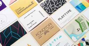
Your business card is a physical representation of your business. Treat it like it is an extension of you, because it ideally will serve as such. This is why your business card must be well-designed. What design elements make a business card effective?
Fonts
Select easy to read fonts. The letters should be large enough to be read without reading glasses. The font could be stylish, but fonts that resemble cursive may count against you in terms of readability. Don’t try to express your creativity with font selection. Unusual fonts may not print well, and they are often a strike against you with clients. It may suggest that you’re going to express your style and act on your whims instead of those of your client.
Some people mix and match fonts on a business card. It is certainly reasonable to use a stylish font for your tag line or call to action at the bottom of the card to distinguish it from your business contact information. However, more than two fonts on a business card will count against you. It distracts from the message. It can interfere with readability. And it may distract from key elements like your logo or sample images.
Contact Information
Let’s be honest. If you hand out a business card with your name and five social media profiles, that will rarely help you. The only exception is if you’re a social media marketer, though this leaves open the question as to why you’re handing out business cards in person instead of promoting yourself on social media. A common mistake new business owners make is choosing the wrong contact information to put on the business card. At a minimum, you must put your personal name or business name on the business card along with the best way to reach you. This generally includes a phone number and email address. If you have a brick and mortar location, that information must be on the business card.
A web domain is an expectation, but it should not be first and foremost on the business card. Social media links are less important, and they are a luxury you can only afford if there is enough room on the card. After all, you’re more likely to turn them into a customer if they visit your website than your Facebook page. However, a recognizable business logo should take precedence.
The Right Eye-Catching Design Elements
One of the most important aspects of business card design are the design elements you include to make the business card stand out from the competition that may be in the same deck. Yet your creativity could backfire if you make the wrong decisions. For example, unusually shaped business cards could get your card tossed, especially if you work in more conservative industries like finance and law. If the card has difficult to handle laminates or looks ugly to all but a niche audience, it hurts you, too. A common mistake is including too many images and design elements, distracting people from your contact information and the call to action to contact you about your services.
This is an article provided by our partners network. It might not necessarily reflect the views or opinions of our editorial team and management.
Contributed content

Founder Dinis Guarda
IntelligentHQ Your New Business Network.
IntelligentHQ is a Business network and an expert source for finance, capital markets and intelligence for thousands of global business professionals, startups, and companies.
We exist at the point of intersection between technology, social media, finance and innovation.
IntelligentHQ leverages innovation and scale of social digital technology, analytics, news, and distribution to create an unparalleled, full digital medium and social business networks spectrum.
IntelligentHQ is working hard, to become a trusted, and indispensable source of business news and analytics, within financial services and its associated supply chains and ecosystems


