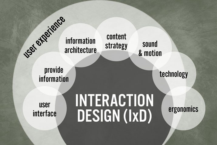
Interaction design (IxD) is an aspect of the user experience (UX) that aims to provide a pleasurable and seamless user-software interaction. It’s particularly important because users who get frustrated when interacting with apps will tend to close and delete them as soon as they try them for the first time.
The presentation and interaction is one of the driving factors that makes users come back to a software and want to use it again. This is why companies should consider bringing in IT outsource services onboard, which may not have the internal resources or time to focus on strong UX design. Click here to see some of the best in the UX design industry.
IxD needs not to be forgotten or thrown to the side. In fact, it should be thought of as an essential task, as important as other product development work done internally.
Interaction Design Defined & Analyzed
It is not an easy task to describe what interaction design means exactly. According to The Interaction Design Foundation, “The goal of interaction design is to create products that enable the user to achieve their objective(s) in the best way possible.”
That definition, however, feels somewhat generic. The phrase ‘best way possible’ could be interpreted in different ways. Does “best” mean “most fun”, “seamless” or simply “easiest”? Does it mean function over form or form over function?
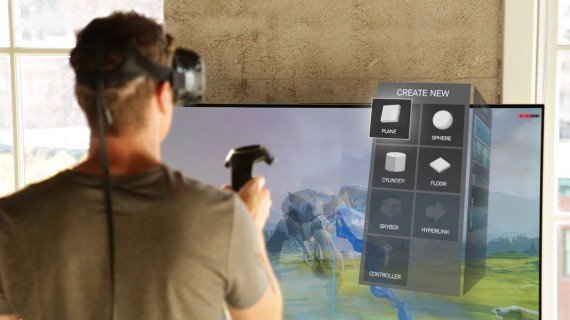
The way users interact with software is wide-ranging. It may involve touchscreen interaction in the case of a mobile app and interaction based on a keyboard and mouse in the case of desktop software. Other software like AR or VR may offer interaction via gestures, movement, space and more.
Good interaction design uses the medium and technology in the best way possible for end-users. It allows for the software to function as intended rather than shoehorning a control mechanism, for instance, from a completely different medium or technology the software was originally designed for.
The 5 Dimensions of Interaction Design
Even though interaction design is an aspect of the overall product overall user experience, it is only one part of it. UX entails more than the interactivity between the user and the software or hardware. It also includes non-interactive aspects like how certain elements look or flow on-screen – whether they are there for interactive, non-interactive or even aesthetic reasons. This includes tree testing ux
Thus, IxD design is more specific than overall UX design. There are five main dimensions, or principles, of IxD design. They should be considered ahead of time when developing a service or product. These include:
- Words or text, like button labels, which give users the right amount of information without overwhelming them.
- Visual representations or graphical elements that help users to physically interact with the interface. They include images, typography and on-screen icons.
- Physical objects/space (3D) through which users interact with the product or service—for instance, a laptop via a mouse, or a mobile phone via fingers.
- Time relates to changes with time lapses across media. This means media changes as the user interacts with it. Examples include animations, videos, and sounds.
- Behavior sets the standards on the overall interactivity a product allows for and looks at how the product reacts to user input. It answers questions such as how users can perform certain actions on a website.

Examples of Effective & Subpar Interaction Designs
Examples of such low-hanging-fruit interaction design choices include robust PC games that made use of many hotkeys on a keyboard as well as a mouse and were ported onto small smartphone screens without much change in the interface or user interactivity.
Many of these games become hardly playable due to all the on-screen buttons users have to click and remember which does what, preventing them from concentrating on the actual game. Games like the 3D and free-roaming Grand Theft Auto series tend to suffer from this for example.
Business software is another example that we can look at. Some user interfaces, like Excel’s, are clearly designed for mouse and keyboard. Thus, they won’t work well on touchscreens or their interfaces will be hard to navigate without major overhauls.
However, solutions exist specifically tailored to different devices. Mobile apps like Google Docs and WordPress are available despite the fact tablet users, at least to a degree, can enter and edit their documents or blogs directly from a web app. With that said, Microsoft, Apple, and Google have been stepping up their game by adding device-tailored features to their apps and even making their apps cross-compatible with multiple devices across clouds.
Google Docs tends to work decently across devices even though it started out as a cloud solution for desktop PC users on the go. With the upcoming iPadOS’ Safari update, it may actually become a viable tablet productivity suite when the device launches this fall.
The Windows 8 Failure
There are both good and bad examples of effective interaction design for software, including operating systems as a whole. Some years ago, Windows 8 was touted as an operating system equally important for touchscreens and traditional PCs. However, due to backlash from Windows users on traditional setups, Microsoft had to scramble an update in the form of Windows 8.1 and started their work not long after on the current flagship product: Windows 10.
When Windows 8 launched in late 2012 it was billed as the all-encompassing Windows with a tiled interface that could be navigated seamlessly across both desktop and tablet interfaces. However, users found this to be far from the truth. The removal of the start button was truly a shock to many PC users who grew accustomed to it over the years and it did not sit well with them.
Windows 8.1, which launched during fall 2013, fixed this by reintroducing the familiar start button and not forcing users adopt to a shoehorned system that may be cross-compatible in nature but less than ideal for traditional Windows users. Although Windows 8.1 was a fix to the lack of a start button and some minor quirks, it was not until Windows 10 launched that Microsoft gave the choice back to consumers and gave the traditional PC users a familiar interface they know and love.

The VR Case
On the other hand, examples of good and effective interaction design choices are drawing apps that replace many Photoshop features, but also add their own touch interactivity and support for the stylus on a tablet. They tend to not be as complicated as desktop apps like Photoshop but offer many of the same features. Two good examples are the apps Procreate and Artstudio Pro.
Virtual reality (VR) is another case study for efficient and inefficient interaction design. Some of the software and games perform well and make the user feel like they are inside the game world. An example of this is a Polish-based title called Superhot. This game makes the player feel like being inside the Matrix and the controls are fine-tuned so he never has to physically move too much or find ways to travel beyond his immediate vicinity.
Other games or VR experiences on the other hand, particularly fast racing games, give players motion sickness or a feeling of nausea after longer play sessions. Thus, solutions were formed over time and other software developers picked up what worked and what didn’t to set industry trends.
How to solve VR interaction when player movement across long distances is involved? Usually, people don’t want to move around too much while wearing a VR headset or physically can’t because there are objects blocking the way or not enough room for movement. Good interaction design should account for people using VR in different physical locations with varied barriers and obstacles around their physical proximity.
Superhot is actually broken up into tiny segments or levels where there is little movement around the player area from sequence to sequence. Other VR software uses a solution in the form of portals or quick travel buttons that transport players across landscapes. The player uses a button click to move forward and this alleviates them having to physically walk across a real room into a wall or other obstacle present.
These issues are still being worked out as newer headsets offer different forms of immersion (such as tether-free wireless headsets) and depending on the room set-up, there is some flexibility involved. However, effective software tends to favor mass appeal over a specific niche of users who may have the space and physical capability to offer more movement than others.
Conclusion
Interaction design is an important aspect of the overall user experience that should be considered ahead as well as during development time. Good developers will be able to work on software that works best for the medium it’s being designed for.
With so many technologies available today from desktop to mobile and VR, it can be easy to forget what medium one is creating software for. Thus, it’s a good idea to have interactive design specialists onboard or to hire outsource development companies to steer developers on the right path of interactivity between users and software. It will help development teams create software that users just want to come back to.
Written by Maciej Dura
This is an article provided by our partners network. It does not reflect the views or opinions of our editorial team and management.
Contributed content

Founder Dinis Guarda
IntelligentHQ Your New Business Network.
IntelligentHQ is a Business network and an expert source for finance, capital markets and intelligence for thousands of global business professionals, startups, and companies.
We exist at the point of intersection between technology, social media, finance and innovation.
IntelligentHQ leverages innovation and scale of social digital technology, analytics, news, and distribution to create an unparalleled, full digital medium and social business networks spectrum.
IntelligentHQ is working hard, to become a trusted, and indispensable source of business news and analytics, within financial services and its associated supply chains and ecosystems


