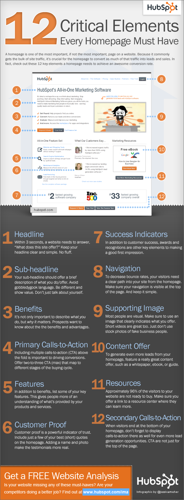
It is really important to have an effective home page. For the majority of businesses that have a high bounce rate, that problem should be a cause for concern. What’s the point of having a flashy site that doesn’t actually generate traffic or have enough of a high conversion rate to assist your sales team. At the conceptualization stage you would want to make sure the following points are well understood by your designer or developer’s. A great website should or for multiple opportunities to convert and the value proposition should be highly apparent at a glance. Your homepage should be easy to navigate and have a high usability factor. Paying attention to these details could actually assist you with SEO.
Your homepage is going to be the most visited page on the site, so it is important to convey any corporate messages effectively, also from there it should provide an effective jump off point, so that users can navigate deeper into the site. A brief look at your site should convey the level of professionalism that your company exudes and highlight your customers next move on the site. I know a firm that simply reproduced the content in their brochures and reflected on the website. This is a big mistake, if you want to strike a chord with your readers you need to carefully consider the reader’s needs and their level of sophistication.
This means you need to generate content specifically written for the web. The content should be easy to digest and easily scalable. Your aim should be to allow your readers to navigate quickly and still find detailed information.
I think most websites in 2013, contain links to social media. While this good, some companies still get it wrong, for example the links would only encourage you to follow the business instead of sharing content. If your readership is happy to digest your content they’re more likely to share it as well. Social media fans are much more likely to convert into repeat visitors. If you are blogging on the site you would want to think about how to feature your blog. There are many good sliders and plug-ins on the market that can do this for you. If you are a WordPress user you would actually be spoilt for choice. Since your blog highlights your expertise and would generate additional interest in your company you’ve got to make sure that they are aware of it from the get go.
Don’t forget to include a compelling About us section. Apart from your value proposition and which segment of the market you’re targeting, you should say why you’re better than the competition this is your chance to boast but make sure it’s verifiable facts. You will want to explain what your company does in simple English, regardless how complex your project or services a reader should be able to discern this within three seconds. If you can, try to get recommendations or accreditations, they will give you a credibility boost. Finally ensure that your contact information is in a highly visible Spot on all contact pages.
HubSpot’s Website Critical Elements Infographic

Hayden Richards is Contributor of IntelligentHQ. He specialises in finance, trading, investment, and technology, with expertise in both buy-side, sell-side. Contributing and advising various global corporations, Hayden is a thought leader, researching on global regulatory subjects, digital, social media strategies and new trends for Businesses, Capital Markets and Financial Services.
Aside from the articles, interviews and content he writes for IntelligentHQ, Hayden is also a content curator for capital markets, analytic platforms and business industry emerging trends. An avid new media explorer Hayden is driven by a passion for business development, innovation, social business, Tech Trading, payments and eCommerce. A native Trinidadian, Hayden is also a veteran, having served with the Royal Air Force Reserves for the past 10 years.
Follow Hayden on Twitter @HaydenARichards, linkedin.com/haydenhrichards and http://www.scoop.it/u/hayden-richards


